
Describing Pie Charts (2)
Making comparisons
Observe the pie charts below
If two or more similar pie charts are displayed, you can make comparisons
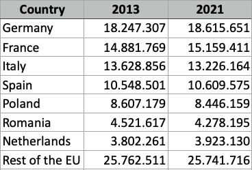
This chart shows the relative size of populations of countries of the European Union in both 2013 and 2021. In this case we can make two sets of comparisons:
- We can make comparisons between the countries in each year.
- We can make comparisons between the two years (i.e. examine any changes from 2013 to 2021).
In this case, we'll look at comparisons between the two years.
The first thing to notice is that there is very little change: all changes amount to less than 1%.
The second change to notice is which countries' populations grew (as a proportion of the whole) and which countries' populations shrank.
You can see that Germany's, France's, Spain's, and the Netherlands' population share grew from 2013 to 2021, whereas the population share of Italy, Poland, and Romania fell.
The percentage population of the total other countries of the European Union fell slightly in this period (although individually some of them may risen or fall; we don't know because we don't have the data).
The largest growth in population share was that of Germany which increased its share from 18.2% to 18.6%.
Germany remained the largest population of the European Union.
Note that you CANNOT say that Germany's population fell or that France's population grew from the percentage share. These charts only show population share, not population numbers (although you can see the actual population numbers by mousing over the chart or from the table below).
So you can make comparisons using pie charts but you would not normally do this with larger datasets, where a column chart or line graph would be preferred.