Pie chart examples
Real world pie charts with notes on how they are commented
To get the most out of these explanations, open the original articles by clicking on the link below each chart.
Example 1
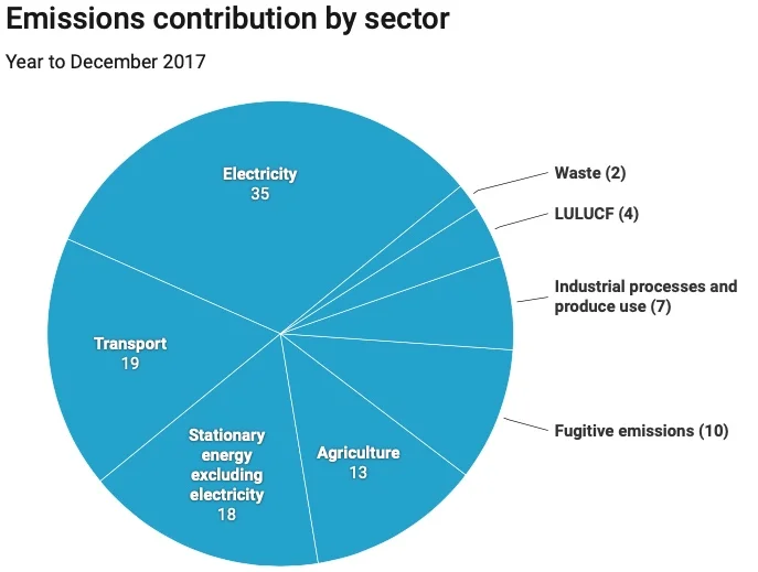
Pie charts are used mainly for showing proportion; what percentage of each sector makes up of the whole. So this is a typical simple example.
It is extremely important when looking at charts to read the title, any units or other information provided on the chart before drawing any conclusions. In this example you can clearly see that greatest contribution to emissions is the energy sector at 35%, followed by the transport sector at 19% and so on.
Normally, as in this case, the sectors are ordered by size, increasing or decreasing according to whether you follow it in a clockwise or anti-clockwise direction.
The article contains more comments about the chart, which you can read on the Conversation website.
Example 2
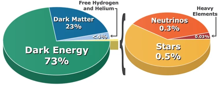
Sometimes the lowest portions in a pie chart are too small to see or label. If they have some significance they may be pulled out of the main chart into a separate one, as in this example.
There is no title on this chart so you would have to read the article to understand the chart, which you can read on the Conversation website.
Example 3
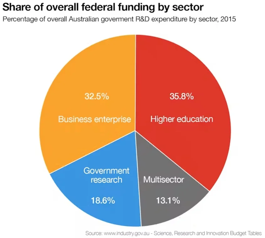
Here is another example of a very simple pie chart. Apart from the title, the original text gives some extra information: "This pie chart reminds us that the higher education sector is a major provider of research and is highly dependent on government funding. It also tells us that business also conducts a great deal of research."
Read the original article on the conversation website.
Example 4
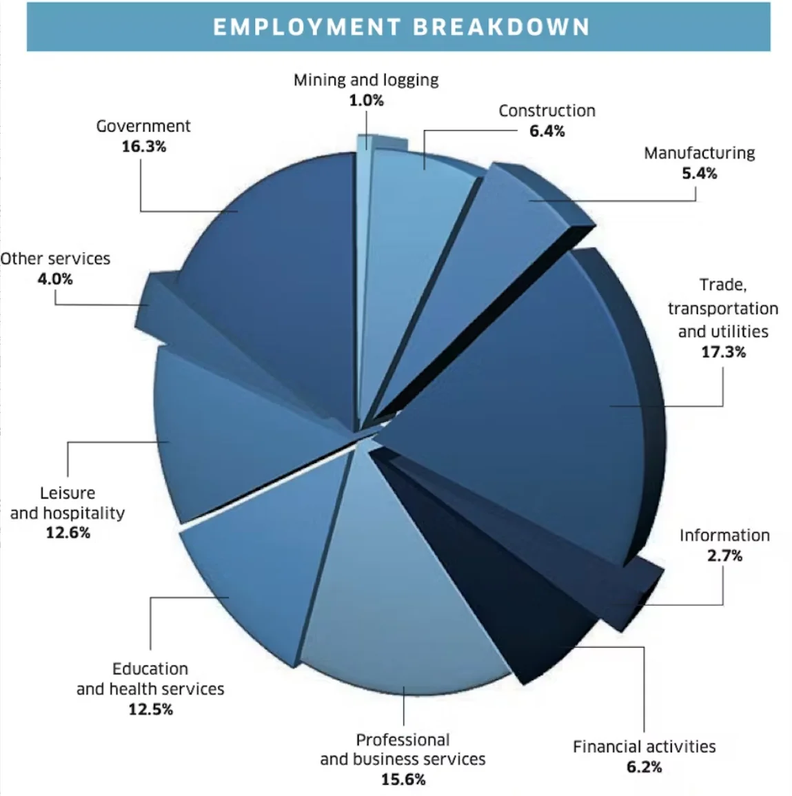
In the original article this chart is given as an example of a bad pie chart. The most important point is that there is no order. This makes if difficult to find the lowest and highest proportions.
There is more information about the problems with this chart in the text of the original article as well as other examples of other types of charts.
Example 5
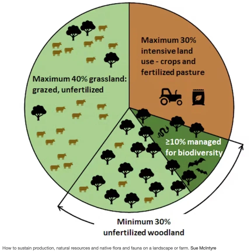
Pie charts are often illustrated, as in this example. This often gives the chart a little more impact and helps the reader to understand or at least contextualise the information.
Note that this chart does not represent facts but rather recommendations. You can read more about this in the original text.
Recommended Reading
Pie charts are not always recommended as a good way of presenting information. They are not easy to use for comparison purposes and are best used for showing proportion where there is a limited amount of information.
