Describing Pie Charts (1)
Pie charts normally illustrate proportion
Observe the pie chart below

Pie Charts normally show proportion, which can be measured in percentages or fractions.
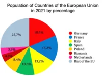
This chart shows the relative size of populations of countries of the European Union in 2021. So we can only make comparisons; we cannot say anything about change.
We can see that the country with the largest population was Germany with 18.6% of the European Union's population. We can also see that the second largest population was that of France with 15.2% of the population.
We do NOT know from this chart which country has the smallest population because the 20 smallest countries are included in one group (Rest of the EU).
You can see that the four largest countries (Germany, France, Italy and Spain) together make up more than half of the European Union's population.
You CANNOT say that the Netherlands has the smallest population: 20 other countries (Rest of the EU) have populations smaller than the Netherlands'.
The twenty smallest countries of the European Union make up slightly more than a quarter of the EU's population.
