
Describing Tables
This table shows the percentage of the annual catch of live fish in various countries of the European Union by tonnes.
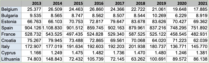
Observing trends in a table is not as easy as it is when you examine a graph, so you need to look carefully at the data. The most striking thing to notice is that Spain is the country which catches the most fish - much more than the next country, France, in every year.
In general, the trend was for a decreasing tonnage of fish caught over the years from 2013 to 2021. For example, Spain caught 16.8% less fish in 2021 than in 2013 and France caught 8.6% less fish over the same period. Only Estonia, Cyprus and Lithuania caught more in 2021 than they did in 2013. But even these countries caught less in 2021 than they did in 2019, so the general trend seems to be a decline in catches.
Important Notes
It is important to note that tables are mainly used for storing and organising data rather than displaying it. Usually, data is selected from a table in order to display a particular trend or comparison, in the form of a line graph, bar chart, or pie chart. And in the real world, few people would ask you to describe a graph or table in words, except for examination purposes. Nevertheless, being able to understand and write about these graphics is useful if you need to point out particular features of your data in a report.