
Describing Bar Charts and Column Charts (3)
Understanding how the axes affect the presentation of the data
Compare the two charts below
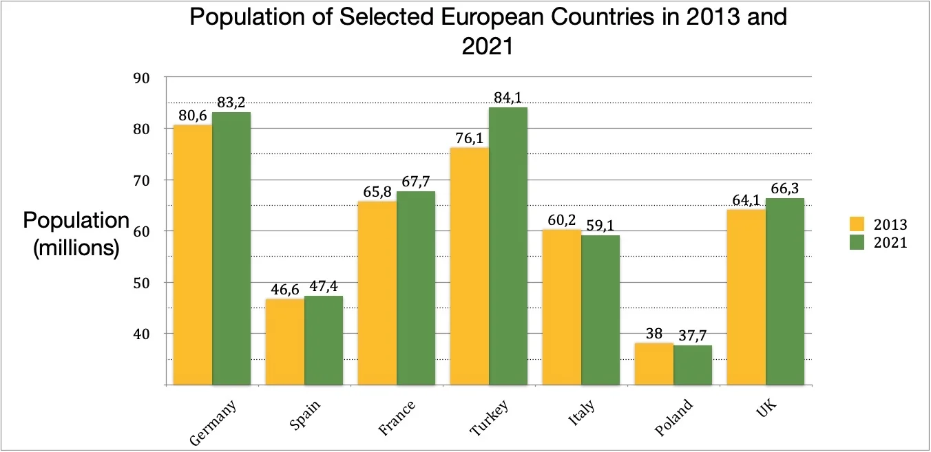
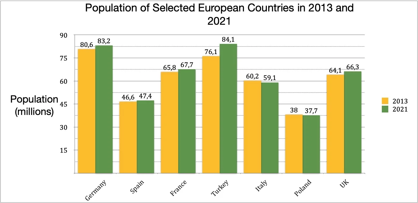
These two charts show EXACTLY the same information. However, it is easier to see the differences in the first chart because the Y axis starts at 30, not zero. Sometimes charts are formatted like this in order to make the differences more obvious.
However, you must be careful when describing a particular chart. If the Y axis does not start from zero differences can seem greater than they actually are. So you must look at the actual numbers when making comparisons. For example, if you look at the first chart and you don't look at the figures, the differences between Italy and Poland seem large. This is because the Y-axis doesn't start at zero; it starts at 30. The second chart gives a more realistic representation.