
Line graph examples
Real world graphs with notes on how they are commented
In texts not written for teaching purposes (e.g. how to describe a graph), graphs are not usually described at all. At most, a salient trend or outlier is pointed out. There may be a short introduction and there may well be extra information in the text which is related to but not included in the graphic. There may also be inferences drawn by the author from information in the graph along with comments, opinions, recommendations, or predictions.
To get the most out of these explanations, open the original articles by clicking on the link below each graph. Many of the original graphs are interactive so you can see the precise data point figures by mousing over the graphs.
Example 1

Line graphs demonstrate change - often change of some factor with change of time. But they can also be used to show comparison as in this case where the percentage of people who smoked in four different levels of education are examined.
There is very little comment about the graph itself in the text apart from "Smoking also declined overall during the same period, while participation in physical activities that meet federal guidelines increased. These are both very positive trends. But clear differences are consistently seen across education levels."
This is quite normal. The graph presents the information very clearly and needs very little explanation. What explanation or comment there is is information or opinion which is not present in the graph.
You can read the whole text in the original article.
Example 2

This is a simple line graph - easy to read and understand. Where there is only one line of the graph sometimes the space between the line and the X-axis is filled in, as in this example. This has no particular meaning but it is sometimes used for clarity or, as perhaps in this case, for emphasis. It gives greater visual impact than a simple line.
There is no comment on this graph in the text apart from the introduction. "From its early beginnings during and after World War II, the commercial industry for polymers – long chain synthetic molecules of which “plastics” are a common misnomer – has grown rapidly."
There is much more information (including charts) about plastics in this article but this chart serves mainly to highlight the enormous increase in the production of plastics since 1950. This is why the visual impact is important.
Example 3

The only comment on this graph is in the subtitle: "The number of the pilots in the U.S. has declined since the 1980s."
There is also a mismatch between the information in the graph and information in the introduction. "According to the Federal Aviation Administration, there were about 827,000 pilots in the U.S. in 1987". Since this graph (in the original article) is interactive you can get the precise figure for 1987 by mousing over the graph. If you wish you can download the actual data by clicking on the link below the graph.
But this graph, like the one in example 2, serves mainly to draw your attention to the obvious decline in the number of pilots.
Example 4
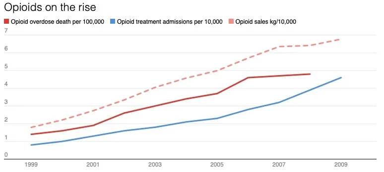
There is a single sentence summary of this graph: "Over the last two decades, as prescriptions for opioids began to soar, rates of addiction and overdose deaths increased in parallel."
Two different words are used to signal the rise in opioid problems: soar and increase. soar is used to signal a very rapid increase but from the graph it doesn't look very rapid. This is due to the scale of the x-axis which is quite spread out. If it were more compressed the rise would appear steeper than it does in this graph. This is why it is always necessary to look at the data and not just the graphics. Certainly a more than 3-fold increase in opioid sales per 10.000 people over 20 years is a significant rise.
This graph also makes a comparison between three trends: opioid overdose deaths, opioid treatment admissions, and opioid sales. You can see from the graph that they have very similar rising trends. In fact, the writer says that they increase in parallel.
Below the graph the writer makes a comment about reason for the increase in opioid prescriptions and the consequences of this.
You can read the exact words in the original article.
Example 5
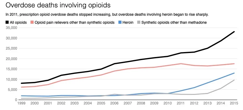
This chart is similar to the one on example 4 but there are two important differences. Firstly, example 4 describes three different but related trends, whereas Example 5 describes opioid deaths caused by 4 different opioids. Secondly, although the time period (the x-axis) is the same, the Y-axes are different: in example 4 the numbers are per 10,000, whereas in example 5 the numbers are absolute figures.
The comment in the subtitle is important "In 2011, prescription opioid overdose deaths stopped increasing, but overdose deaths involving heroin began to rise sharply."
There is a further comment about this below the graph in the original article: Until 2011, most opioid overdose deaths involved prescription opioids. Then prescription opioid overdose deaths levelled off, while overdose deaths involving heroin began to soar.
The rest of the comments concern the reason for this change.
You can read the exact words in the original article.
Example 6

This chart shows estimated values in a future scenario. It estimates future trends in smoking prevalence in New Zealand. New laws about nicotine content of cigarettes, who can sell them and who can buy them are aimed at reducing cigarette use in New Zealand. The graph show projected trends under current laws (the unbroken lines) and estimated trends if the laws come into action (the dotted lines lines). The colours represent ethnic groups and male or female.
There is no comment about this graph in the text. You can see however that they estimate a rapid drop in the prevalence of smoking if these laws are passed.
This is a good example of a projection chart which also compares various categories.